Many organizations will spend significant sums of money on phishing training for employees. Taking the form of regular awareness training, or even simulated phishes to test employee awareness, this is a common practice at larger companies.
However, even after training, a consistent baseline of employees will still click a malicious link from an unknown sender. Today, we’ll look at a potential reason why that might be: corporate communications often look like phishes themselves, causing confusion between legitimate and illegitimate senders.
Corporate communications templates
Below is an email template found on a Microsoft technet blog, used as an example of how a sysadmin can communicate with users.
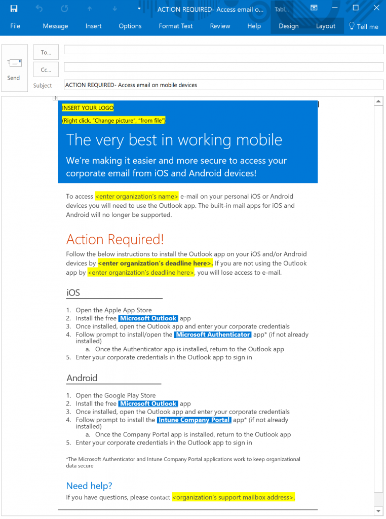
While well meaning, and providing users with pretty good instructions, this template falls afoul of phishing design in a few ways.
- The large “Action Required” in red with an exclamation point creates a false sense of urgency disproportionate to the information presented.
- There is no way provided to authenticate the message as legitimate corporate communications.
- The email presents all information at once on the same page, irrespective of relevance to an individual user.
- The link for assistance is at the bottom and suggests a generic mailbox rather than referencing a person to contact.
So what’s the harm here? Surely a user can ignore some over-the-top design and take the intended message? One problem is that per Harvard Business Review, the average office worker receives on average 120 emails per day. When operating under consistent information overload, that worker is going to be taking cognitive shortcuts to reduce interactions with messages not relevant to them.
So training the employee to respond reflexively to “Action Required” can cue them to do the same with malicious emails. Including walls of texts in the body of the email reinforces scanning for a call to action (especially links to click), and a lack of message authentication or human assistance ensures that if there’s any confusion about safety, the employee will err on the side of not asking for help.
Essentially, well-meaning communications with these design flaws train an overloaded employee to exhibit bad behaviors—despite anti-phishing training—and discourage seeking help. It’s no wonder that, according to the FBI, losses from business email compromise (BEC) have increased by 1,300 percent since January 2015, and now total over $3 billion worldwide.
With this background in mind, what happens when the employee gets a message like this?
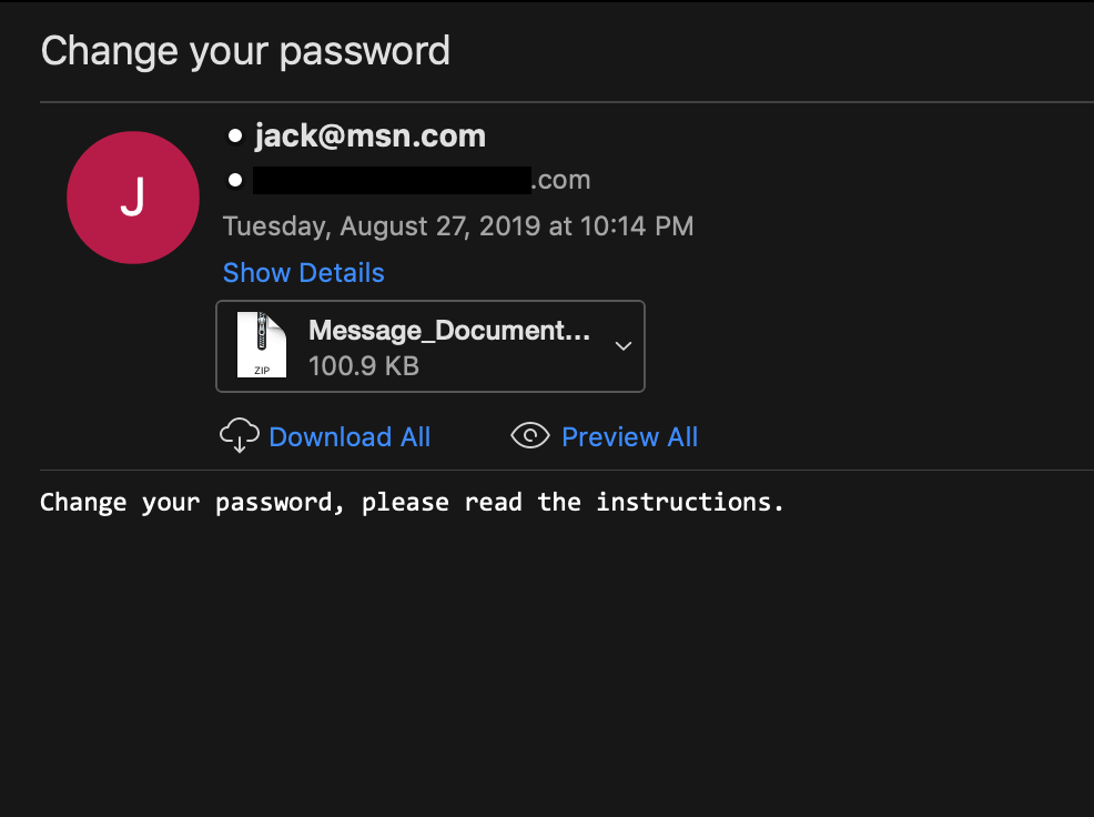
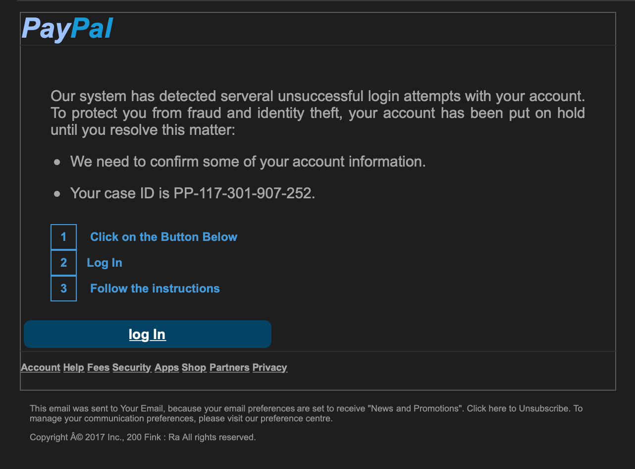
Of note is that both phishes are more accessible to a skimming reader than the Microsoft corporate notification, and the calls to action are less dramatic. The PayPal phish in particular has a passable logo and mimics the language of an actual account alert reasonably well.
A closer reader would spot incongruities right away: The first phish would be caught instantly. For the second, the sender domain does not belong to PayPal. If you copy the link and paste into a text editor, the link goes to an infected WordPress site rather than PayPal, and the boxed numbers with instructions look weird. But an employee receiving 120 emails a day is not a close reader. The phishes are “good enough.”
A safer alternative
So how do we do better? Let’s look at a notification email from AirBnB.
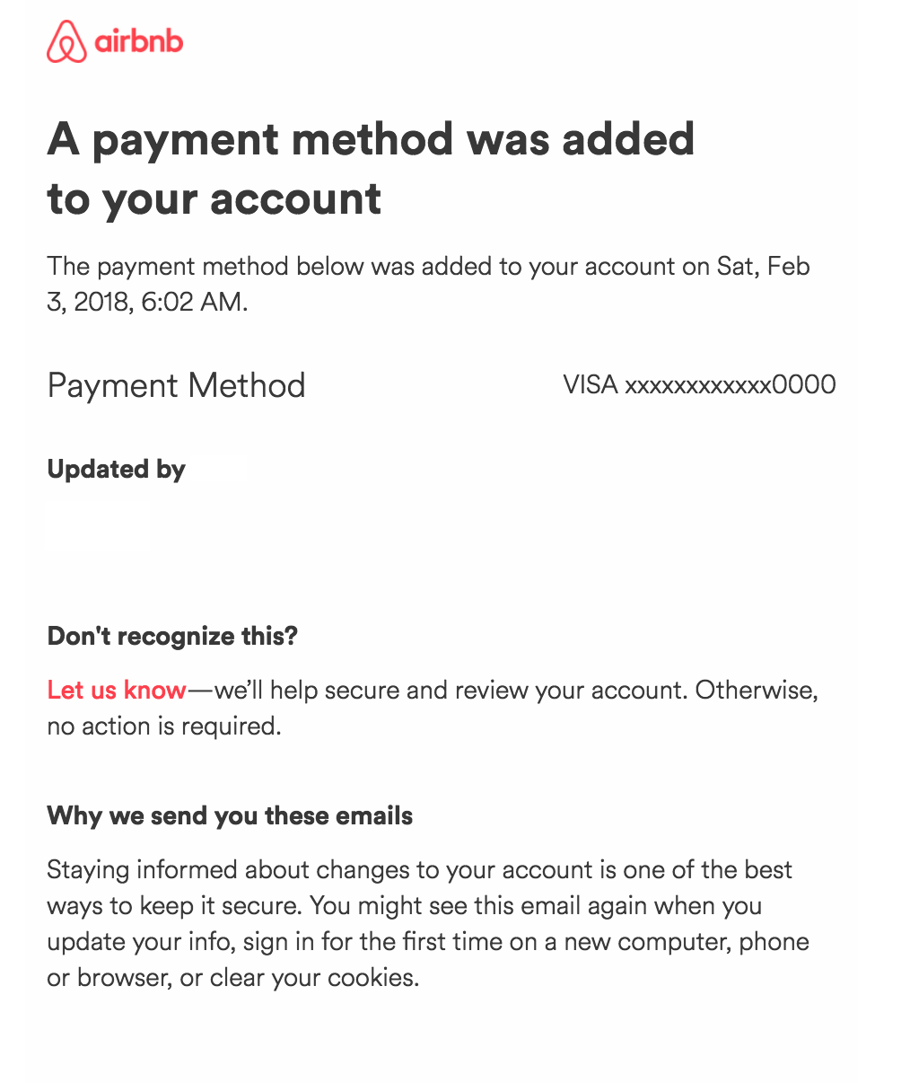
First and foremost, the notification is brief. The entire content of relevance to the user is communicated in a single sentence, made large and bold for readability upfront. What follows are details for the end user to authenticate the transaction, listed in an order of probable descending interest to the user.
Next is a clear path to obtain assistance, voiced in language suggestive of a person at the other end. Last is a brief explanation of why the user should consider the communication legitimate, with multiple use cases provided to set expectations.
The myth of the stupid user
Industry discussion of phishing and click through rates centers largely around how awful and ignorant users are. Solutions proffered generally concern themselves with restricting email functionality, “effective” shame-and-blame punishments for clicking the malicious link, and repetitive phish training that neither aligns to how users engage with email, nor provides appropriate tools for responding to ambiguous emails, like the notification template above.
All of this is a waste of time and budget.
If an organization has a “stupid user” problem, a more effective start to address it would be looking at design cues in that user’s environment. How many emails are they getting a day, and of those, how many look functionally identical? How many aren’t really relevant or useful to their job?
When network defenders send out communications to the company, do they look or feel like phishes? If the user gets a sketchy email, who’s available to help them? Do they know who that person is, if anyone? Structuring employees’ email loads such that they follow the steps below will both “smarten up” an employee quickly and cost nothing. Employees should therefore:
- Have a light enough burden to engage critically with messages
- Get corporate comms tailored to their job requirements
- Have an easy way to authenticate that trusted senders are who they say they are
- Be able to get help with zero friction
So before organizations engage in more more wailing and gnashing of teeth over the “stupid user” and the cost of training and prevention, think for a long while on how communication happens in your company, where the pain points are, and how you can optimize that workflow.
After all, wouldn’t you like to get less email, too?